

More than half of all web traffic comes from phones and tablets. If your site doesn’t adapt to different screen sizes, you’re turning away potential customers before they even see what you offer. That’s exactly why learning responsive web design step by step matters, and it’s something we build into every project at Avatar Website Design.
We’ve designed hundreds of mobile-ready websites for small businesses, so we know what works and what breaks. This guide pulls from that hands-on experience to walk you through building a responsive site from scratch using HTML and CSS. You’ll learn the core techniques, fluid grids, flexible images, and media queries, in a practical, code-along format that actually sticks.
Whether you’re a small business owner trying to understand what goes into your website or a beginner developer building your first project, this guide gives you a clear path from a static layout to a fully responsive one. No frameworks, no shortcuts, just clean HTML and CSS fundamentals that will serve you well for years. Let’s get into it.
What responsive web design means in practice
Responsive web design is not a single feature you toggle on. It’s a combination of techniques that work together to make your layout, images, and text adapt to whatever screen a visitor uses. In practice, this means your website looks clean on a 27-inch desktop monitor, a 13-inch laptop, an iPad, and a smartphone, all from the same HTML file. The browser does the heavy lifting, but only if your code gives it the right instructions.
Responsive design is not about making things "look okay" on mobile. It’s about building a layout that functions equally well at every screen size, without writing separate versions of your site.
Most beginners assume responsive design means writing separate versions of a website for desktop and mobile. That approach, called adaptive design, involves creating fixed layouts for specific screen widths and serving the right one based on the device. Responsive design works differently: one codebase, fluid rules, and the browser figures out the rest. Understanding this distinction saves you a significant amount of wasted effort before you write a single line of code.
The three pillars of responsive design
Every responsive web design step by step tutorial worth following covers the same three foundations. These aren’t optional extras you can skip when you’re short on time. They’re the core mechanics that make the whole system work, and each one addresses a specific problem that fixed-width layouts create.
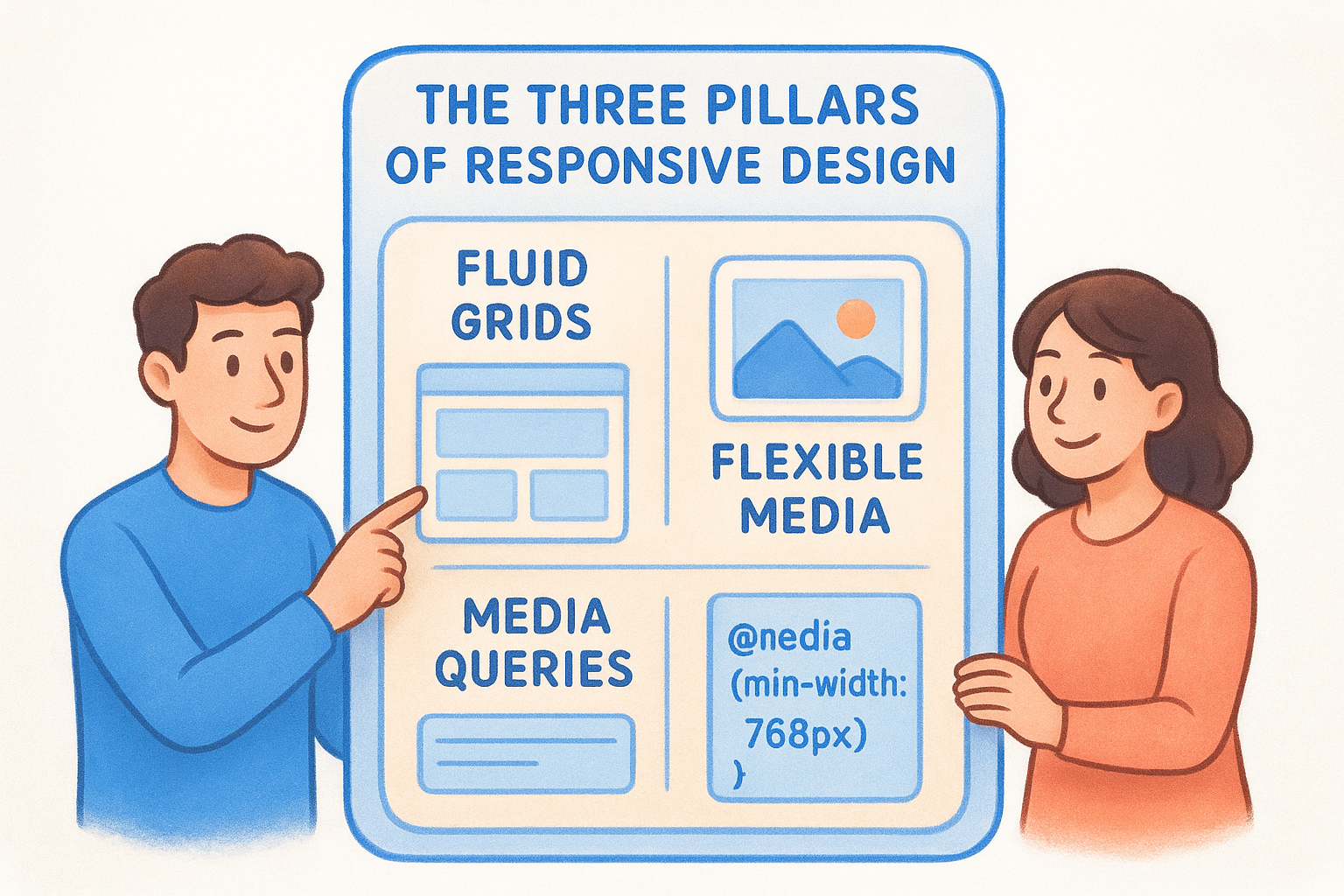
| Pillar | What it does | How you use it |
|---|---|---|
| Fluid grids | Sizes columns as percentages, not fixed pixels | Use width: 50% instead of width: 400px |
| Flexible media | Images and video scale within their containers | Set max-width: 100% on media elements |
| Media queries | Apply different CSS rules at specific screen widths | Use @media (min-width: 768px) { ... } |
Fluid grids prevent your layout from overflowing on small screens because columns shrink proportionally instead of staying a fixed pixel size. Flexible media stops images from breaking out of their containers, which is one of the most common visual problems on mobile devices. Media queries let you apply targeted style changes at defined breakpoints, giving you precise control over how your layout shifts as the screen gets wider. All three work together. Remove any one of them and the others can’t fully compensate.
What "mobile-first" actually means in your CSS
You’ve probably seen the term mobile-first used frequently. In practice, it means you write your base CSS for the smallest screen first, then use media queries to add or modify styles as the screen width increases. This approach is more efficient because mobile styles tend to be simpler: fewer columns, larger tap targets, stacked elements, and minimal decoration.
Writing desktop-first and then trying to compress everything into a small screen is significantly harder. You end up fighting your own CSS by piling overrides on top of overrides, and the result is often bloated, unpredictable code. Mobile-first forces you to prioritize the content and interactions that matter most, then layer in visual complexity for larger screens. It also aligns with how Google crawls and indexes websites, since Google’s systems primarily use the mobile version of your content for ranking. This guide follows mobile-first throughout every step, so you’ll see exactly how it plays out in real code.
Step 1. Set up the HTML and viewport
Before you write a single CSS rule in this responsive web design step by step guide, you need a clean HTML foundation. The structure of your HTML file and one specific meta tag determine whether the browser can interpret your layout correctly across all screen sizes. Get these right at the start and everything that follows becomes significantly easier.
Start with a clean HTML5 boilerplate
Every responsive site starts from the same basic HTML5 document structure. If you skip or misplace key elements here, browsers will make assumptions that can break your layout before CSS even loads. The <!DOCTYPE html> declaration tells the browser to use modern HTML5 rendering standards, and the semantic elements like <header>, <main>, and <footer> give your content meaningful structure that both browsers and screen readers rely on.
Here’s the boilerplate you’ll build on throughout every step in this guide:
<!DOCTYPE html>
<html lang="en">
<head>
  <meta charset="UTF-8">
  <meta name="viewport" content="width=device-width, initial-scale=1.0">
  <title>Your Page Title</title>
  <link rel="stylesheet" href="styles.css">
</head>
<body>
  <header>
    <nav><!-- navigation links --></nav>
  </header>
  <main>
    <!-- primary page content -->
  </main>
  <footer>
    <!-- footer content -->
  </footer>
</body>
</html>
Save this as index.html and your linked stylesheet as styles.css in the same folder. Keep these two files together as your working directory for every step ahead.
Why the viewport meta tag is non-negotiable
The viewport meta tag is the most critical line in your HTML for responsive design. Without it, mobile browsers apply a default behavior where they render your page at a typical desktop width, roughly 980px, and then scale the whole thing down to fit the phone’s screen. The result looks like a miniature desktop site, not a responsive one.
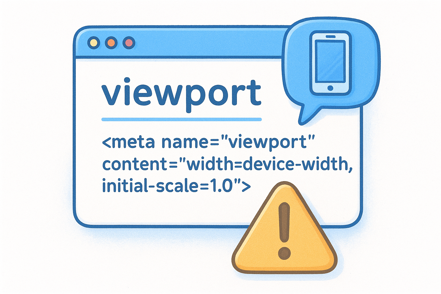
Adding
<meta name="viewport" content="width=device-width, initial-scale=1.0">tells the browser to match the screen’s actual width and set the starting zoom level to 1, which is the baseline every CSS responsive technique depends on.
The width=device-width value sets the layout viewport to the device’s actual screen width in CSS pixels. The initial-scale=1.0 value prevents automatic zoom when the page first loads. Place this tag once inside your <head> element and every responsive technique in the steps that follow will work the way it’s supposed to.
Step 2. Write mobile-first base CSS
Now that your HTML structure is in place, you need a base stylesheet that removes browser inconsistencies and sets up your styles for the smallest screen first. This is the core of the mobile-first approach in this responsive web design step by step guide: write the simplest version of every style rule, then build upward from there. Open your styles.css file and work through the following two steps in order.
Start with a CSS reset
Browsers apply their own default styles to HTML elements, and these defaults vary between Chrome, Firefox, and Safari. A CSS reset strips those inconsistencies so you’re working from a predictable baseline. You don’t need a large reset library for most projects. A focused set of rules covers the essentials:
*, *::before, *::after {
  box-sizing: border-box;
  margin: 0;
  padding: 0;
}

body {
  font-family: sans-serif;
  font-size: 16px;
  line-height: 1.5;
  color: #222;
}

img, video {
  display: block;
  max-width: 100%;
}
The box-sizing: border-box rule tells the browser to include padding and border in an element’s total width, which prevents layout overflow bugs that are otherwise frustrating to track down. Setting max-width: 100% on images as part of your reset means flexible media is handled from the very start, not patched in later as an afterthought.
Write your mobile-first component styles
With your reset in place, write every component’s default styles as if you’re only designing for a narrow phone screen. This means single-column layouts, full-width containers, and clean typography. You add visual complexity later with media queries, not before.
Writing mobile styles first forces you to decide what actually matters on your page, rather than trying to compress a cluttered desktop layout into a small screen after the fact.
Here’s how a basic header and navigation look when written mobile-first:
header {
  width: 100%;
  padding: 1rem;
  background-color: #fff;
}

nav {
  display: flex;
  flex-direction: column;
  gap: 0.5rem;
}

nav a {
  font-size: 1rem;
  text-decoration: none;
  color: #333;
}
At this stage, your navigation stacks vertically and fills the full container width. You’ll convert it to a horizontal row in a later step using media queries, once the screen has enough space to support that layout without crowding the links.
Step 3. Build a fluid layout with Flexbox and Grid
Your mobile-first base CSS stacks everything vertically by default, which is exactly where you want to start. Now you need a fluid layout system that stretches and compresses content naturally as the screen width changes. This is the step in any responsive web design step by step guide where you replace fixed pixel widths with proportional, flexible containers that let the browser calculate sizing for you. Two CSS tools handle this work: Flexbox for one-dimensional layouts and Grid for two-dimensional ones.
Use Flexbox for one-dimensional layouts
Flexbox controls how elements arrange themselves along a single axis, either horizontally or vertically. It’s the right tool for navigation bars, card rows, button groups, and any layout where items need to wrap or distribute space across one direction. The key is setting flex-wrap: wrap so items drop to the next line instead of overflowing when space runs out.
Here’s how to build a flexible card row that stacks on mobile and flows into multiple columns as space allows:
.card-row {
  display: flex;
  flex-wrap: wrap;
  gap: 1rem;
}

.card {
  flex: 1 1 280px;
  padding: 1.5rem;
  background-color: #f5f5f5;
}
The flex: 1 1 280px shorthand tells each card to grow and shrink freely but never collapse below 280px wide. Below that threshold, cards automatically wrap to a new row, giving you a responsive multi-column layout without a single media query.
Use CSS Grid for two-dimensional layouts
CSS Grid gives you control over both rows and columns simultaneously, making it the better choice for full-page layouts, image galleries, and content areas with distinct regions. The auto-fit keyword combined with minmax() creates a grid that adds columns automatically as screen width increases, which removes the need for multiple breakpoints in many cases.
.grid-layout {
  display: grid;
  grid-template-columns: repeat(auto-fit, minmax(240px, 1fr));
  gap: 1.5rem;
}
A grid column set to
minmax(240px, 1fr)will never shrink below 240px and will always fill an equal share of available space, making your layout fluid without hard-coded breakpoints.
Apply this pattern to your main content area and you’ll have a layout that adapts from one column on mobile to three or four columns on large screens with minimal code.
Step 4. Make images, video, and text scale
Your layout adapts through Flexbox and Grid, but images, embedded video, and typography need their own scaling rules in any responsive web design step by step process. Fixed pixel dimensions on these elements break your layout the moment the screen narrows, because the browser has no instruction to adjust them. You need explicit CSS rules that let media and text respond proportionally to the space available.
Scale images and embedded video
Images are the most common source of horizontal overflow on mobile screens. Setting max-width: 100% in your reset handles basic <img> tags, but embedded video from YouTube or Vimeo requires a different approach because those elements use <iframe> tags with fixed width and height attributes baked into the embed code.
Wrapping an iframe in a container with a set aspect ratio and using absolute positioning on the iframe itself gives you a fluid video that maintains its proportions at any screen width.
Use this pattern to make any embedded video scale correctly across all screen sizes:
.video-wrapper {
  position: relative;
  padding-bottom: 56.25%; /* 16:9 aspect ratio */
  height: 0;
  overflow: hidden;
}

.video-wrapper iframe {
  position: absolute;
  top: 0;
  left: 0;
  width: 100%;
  height: 100%;
}
Wrap your <iframe> inside a <div class="video-wrapper"> and the video will fill its container while locking the 16:9 ratio on every screen size without any JavaScript.
Scale typography with relative units
Fixed pixel font sizes stop responding when users adjust their browser’s default text size for accessibility. Switching to relative units like rem lets your typography scale with the user’s settings and gives you a single point of control over your entire type scale.
Set your root font size on the html element and use rem values to define all other sizes in your stylesheet:
html {
  font-size: 100%; /* equals 16px in most browsers */
}

h1 { font-size: 2rem; }   /* 32px */
h2 { font-size: 1.5rem; } /* 24px */
p  { font-size: 1rem; }   /* 16px */
Using rem units throughout your stylesheet means one change to the root value adjusts every element proportionally, which saves you from hunting down and updating individual font sizes across dozens of rules when you need to shift your typography scale.
Step 5. Add media queries and breakpoints
Media queries are the layer in any responsive web design step by step process where you define the exact points at which your layout shifts. Up to this step, your Flexbox and Grid rules have been handling a lot of the fluid adaptation automatically. Media queries give you precise, intentional control over style changes that can’t happen through proportional sizing alone, like switching a stacked navigation to a horizontal row or switching a single-column text section to a two-column layout.
Choose your breakpoints based on content, not devices
The most common mistake developers make is setting breakpoints to match specific device screen widths, like 375px for iPhone or 768px for iPad. Device sizes change every year, and targeting device dimensions locks your layout to hardware that may already be outdated. Instead, resize your browser window slowly from narrow to wide and add a breakpoint only when your content starts to look cramped or awkward. Let the content tell you where the layout needs to shift.
Your breakpoints should reflect where your design breaks, not where a specific device starts.
Here are three practical breakpoints that cover most small business website layouts:
| Breakpoint | Min-width value | Typical use |
|---|---|---|
| Small tablet | 480px | Two-column card layouts, wider nav |
| Tablet / landscape | 768px | Horizontal nav bar, sidebar layouts |
| Desktop | 1024px | Full multi-column layouts, wider containers |
Write media queries that build upward
Because you wrote mobile-first base styles, every media query you add now only needs to handle the differences at larger widths. You never override your own styles by undoing what you already wrote. This keeps your stylesheet clean and your rule specificity predictable throughout the file.
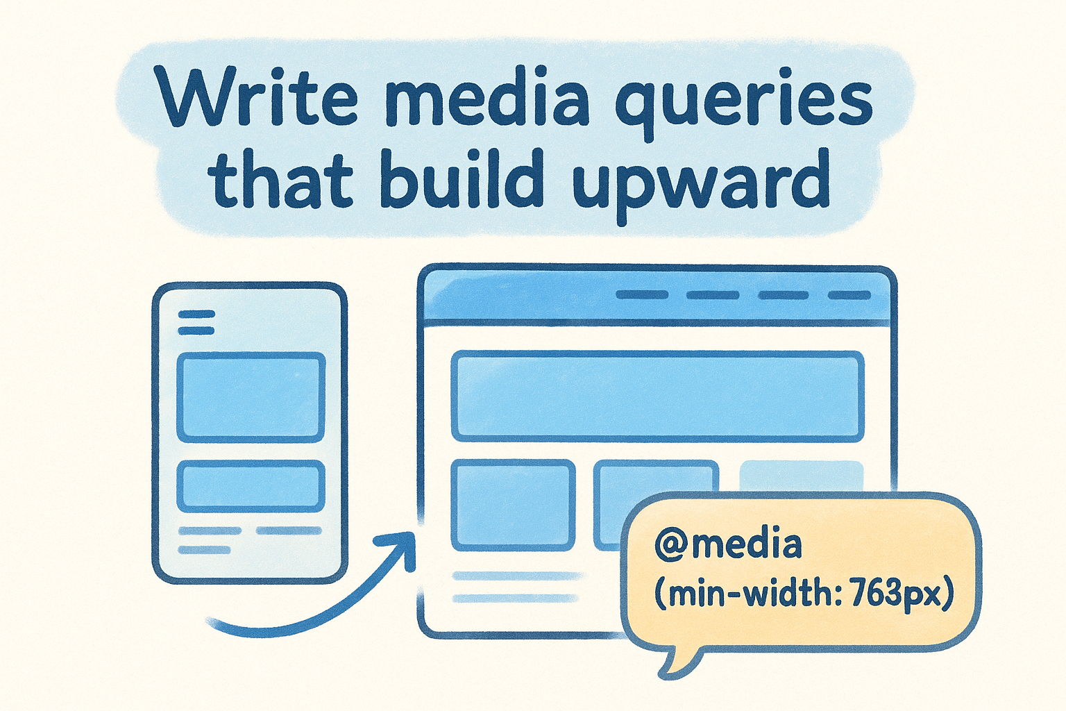
Here’s how to apply those breakpoints to your navigation and layout in practice:
/* Tablet: 768px and up */
@media (min-width: 768px) {
  nav {
    flex-direction: row;
    gap: 1.5rem;
  }

  .card-row {
    flex-wrap: nowrap;
  }
}

/* Desktop: 1024px and up */
@media (min-width: 1024px) {
  main {
    max-width: 1100px;
    margin: 0 auto;
  }
}
Each query layers new styles on top of the mobile base without touching the rules beneath it, which is exactly how mobile-first media queries are supposed to work.
Step 6. Test, fix, and ship
You’ve written the HTML, the base CSS, the fluid layout rules, and the media queries. Before you call this responsive web design step by step process complete, you need to verify that every screen size works the way you intended. Testing isn’t optional cleanup at the end. It’s the step that reveals all the small issues your code editor can’t catch.
Test across real devices and browsers
Start with your browser’s built-in developer tools. In Chrome, open DevTools with F12, click the device icon, or press Ctrl+Shift+M, and drag the viewport width from narrow to wide while watching your layout shift. Check every breakpoint you defined in Step 5. Look for elements that overflow horizontally, text that becomes unreadable, or images that break out of their containers.
DevTools device simulation is a fast starting point, but it doesn’t replace testing on actual hardware because touch behavior and real rendering engines differ from simulated environments.
After DevTools, test on at least one real phone and one tablet if you have access to them. Pay close attention to tap target sizes on mobile. Buttons and links should be at least 44×44 CSS pixels so fingers can hit them without difficulty across all devices.
Fix the most common responsive issues
Most layout problems fall into a short list of repeatable causes. Run through this checklist before you ship:
- Horizontal scrollbar appearing: An element has a fixed pixel width wider than the viewport. Use
max-width: 100%or switch to a percentage orfrunit. - Images overflowing their container: The
max-width: 100%rule from your reset is missing or overridden by an inline style attribute. - Text too small on mobile: You’re using fixed
pxunits for font sizes. Switch toremas covered in Step 4. - Navigation links overlapping: Your breakpoint for the horizontal nav is too low. Increase the
min-widthvalue in your media query. - Grid columns not collapsing: Check that
minmax()has a sensible minimum value so columns wrap before they overflow.
Once your checklist is clear and every breakpoint behaves as expected across multiple browsers, commit your code and deploy. A working responsive site published today is worth more than a perfect one still sitting on your local machine.
Put it into practice on your own site
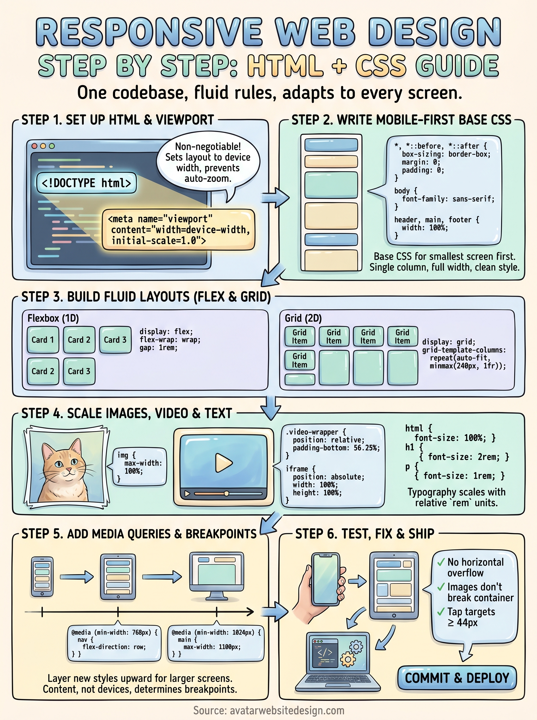
You now have the full responsive web design step by step process: a clean HTML foundation, mobile-first CSS, fluid Flexbox and Grid layouts, scalable media, targeted breakpoints, and a testing checklist. These aren’t abstract concepts. They’re specific techniques you can apply today to any project, whether you’re building from scratch or fixing an existing site that breaks on mobile.
Start with a single page. Set up your boilerplate, write your reset, and add one media query. Shipping something small and functional teaches you more than reading ever will, and each iteration makes the next one faster. The skills in this guide compound quickly once you put them into practice on real code.
If you’d rather have a professionally built, mobile-ready website without the learning curve, the team at Avatar Website Design builds custom responsive sites for small businesses at every stage.